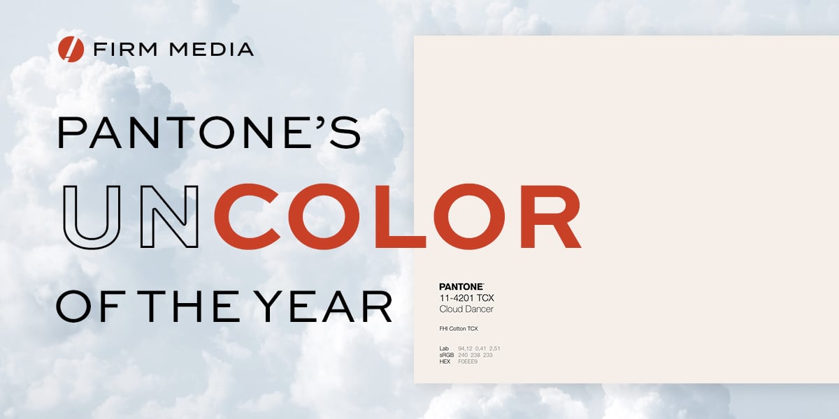
Pantone’s 2026 Color of the Year is Cloud Dancer, a soft, willowy white presented as calm, balanced, and reflective. A “blank canvas” for an overstimulated world.
As a Designer and Creative Director, I get the intent. I also can’t help feeling slightly underwhelmed. Color of the Year used to be about bold, specific hues that carried a mood: rich blues, hyper-saturated magentas, earthy corals. Now we have arrived at white.
And yes, technically speaking, white is often described as the absence of color in pigment. Pantone calls Cloud Dancer “a lofty white whose aerated presence acts as a whisper of calm and peace in a noisy world.” That does not make it irrelevant, but it does make it an odd hero for a title like “Color of the Year.”
The Safe Choice in a Tired Moment
Recent years have been full of comfort neutrals: soft peaches, muted browns, and now this airy white. It makes sense. In a world that feels chaotic and noisy, quiet colors are easier to live with. They are versatile, calming, and widely marketable.
That is also what makes this choice feel safe.
“This is the third year in a row where the Pantone color has slid more and more into unobtrusive, dispassionate shades.”
Color of the Year is supposed to be a statement about where we are and where we are going. Picking a gentle white feels less like a statement and more like a compromise, something no one can really object to, but no one gets particularly excited about either.
Is this a bold read on our cultural mood, or just the path of least resistance?
“I’m disappointed. Not one of these colors feels like it’s meeting the moment… an avalanche of beige punctuated by a few dark neutrals and one controversial white.”
– Julia Cancilla, Elle Decor
White as Frame, Not Focal Point
To be fair, white is not “nothing” in design. It is structure, negative space, breathing room, the silence that makes the music work. Good use of white can make typography, imagery, and color sing.
That is exactly the point. White is usually the frame, not the artwork.
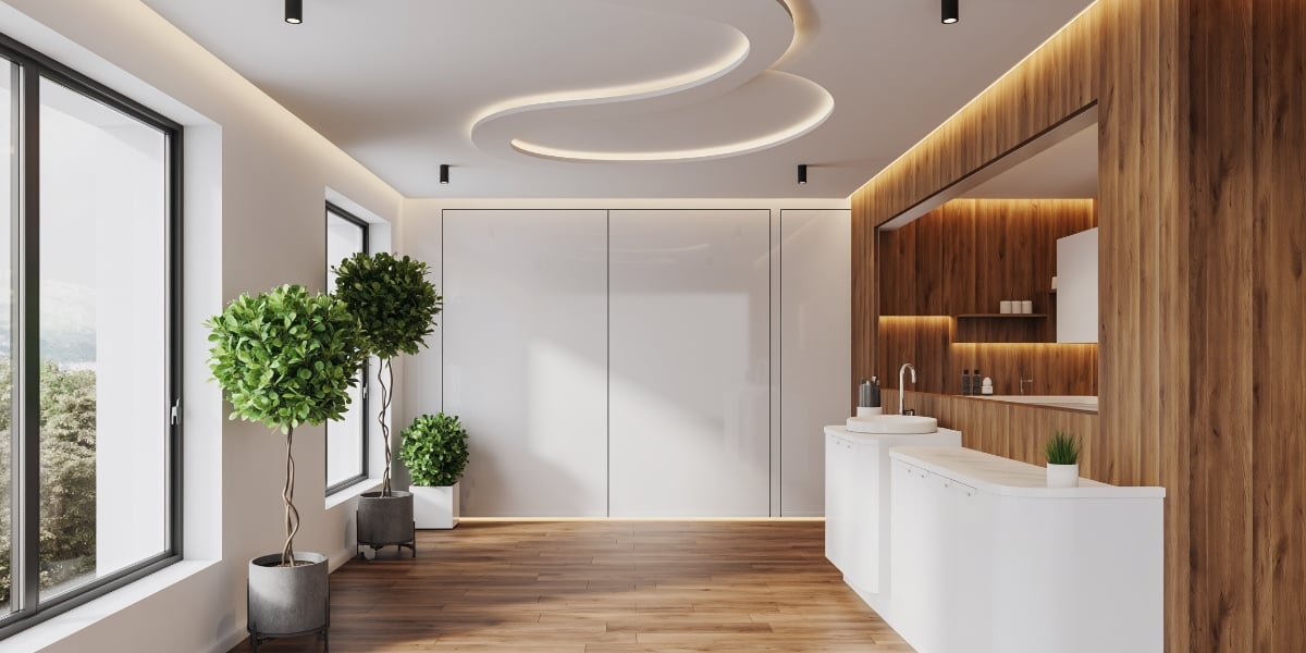
In the medical field, that frame carries a lot of meaning. White coats, white walls, and bright exam rooms are all tied to ideas of cleanliness, safety, and control. At the same time, too much stark white can feel clinical in a bad way. It can remind people of anxiety, procedures, and long hours under fluorescent lights. For healthcare brands, white can either support trust or amplify stress, depending on what you put inside it.

At Firm Media, where we work primarily with medical practices, we are not avoiding white. We are more interested in using it as a base that lets warmth and humanity show through. That might mean pairing clean white space with organic textures, natural light, skin tones, and confident accent colors, so the result feels professional and sterile in the right way, but still human and approachable.
So when we crown white as the star, it flips the usual hierarchy. Instead of saying, “Here is the mood of the year,” it says, “Here is the space where moods might happen.” That is interesting philosophically, but it can also feel like a dodge, especially in a visual world already saturated with beige minimalism and “clean” branding.
I love minimalism when the frame makes the artwork stronger. If Cloud Dancer becomes the whole story instead of the support, then the work stops feeling minimal and just starts feeling flat.
The Responsibility of an Empty Page
From a design perspective, I am still disappointed we did not get something more specific, more challenging, more unapologetically colorful. A white Color of the Year feels cautious. It steps back instead of stepping forward.
At the same time, an empty page is never really neutral. It quietly asks what you are willing to put on it. It forces intention.
Cloud Dancer can work the same way. It can expose lazy choices very quickly. If everything sits on top of this soft white and still feels generic, then the problem is not the color. It means the problem sits in the idea and in the intention behind it.
So the question becomes less about Pantone and more about us:
- What do we consider worth highlighting against that white?
- What ideas are strong enough to hold their own in a quiet, stripped back space?
- Where are we willing to bring back saturation, contrast, and risk?
I still wish the Color of the Year were an actual color. But maybe the more interesting test for 2026 is this: with all that room to move, what are we willing to say visually that actually matters?
“At this point, we can only hope that Cloud Dancer is a bellwether promising clearer skies ahead.”
– Vittoria Benzine, Artnet