


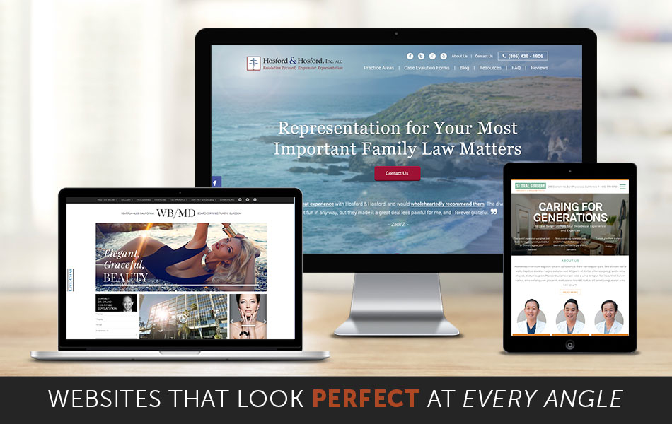
Before we answer your question, did you know that smartphone users check their devices 150 times a day? With a growing percentage of your target audience accessing websites through their mobile devices, it is becoming a trend to create websites that are responsive.
What is Responsive Web Design?
Responsive Web Design (RWD) is the approach in web design aimed to provide an optimal viewing experience across different screen sizes, platforms and devices. With 46% of mobile users reporting problems viewing a static site, RWD enhances the user experience and allows them to browse the website with ease.
Firm Media, has made it a standard to design and develop all websites to be responsive. Using fluid grids, flexible images, and font sizes, your target audience is able to view the same exact information on different devices, without sacrificing their experience.
Creating a Responsive Web Design for your Professional Practice
Before we start any project, our design team spends a great amount of time analyzing data on your existing web presence, RWD, and other proven methods to build our foundation for the project.
- Once we have an understanding of what our clients are looking for, our design team then puts together a customized website design with mobile-design first in mind
- Developers execute the designs with great attention to detail and bring the comps to life
- After we have a running website, our inspection team then tests the website on multiple screen sizes, platforms and devices
- Finally, the launch team makes final adjustment before we officially launch a website
What Are the Benefits of Having a Responsive Web Design?
Improving the overall user experience for your website visitors is just beginning. Having responsive websites has helped our clients decrease bounce rates and increase conversion rates. And especially with the latest algorithm update from Google (which began rolling out today April 21, 2015), responsive web design will help your SEO efforts to rank better in search.
Don’t Have a Responsive Web Design? It’s time to update your website.
Not sure if your site is mobile-friendly? You can check here: https://www.google.com/webmasters/tools/mobile-friendly/ That is a first step. Responsive Web Design is the next level to make sure any device can display your professional practice website in the best way!
